9:06 PM
, EST
TOP: APP DE MOBILIDADE
TOP: APP DE
MOBILIDADE
TOP: APP DE
MOBILIDADE
Redesigning São Paulo’s Transit App Faster Access and Less Friction
Redesigning São Paulo’s Transit App Faster Access and Less Friction
SUMMARY
SUMMARY
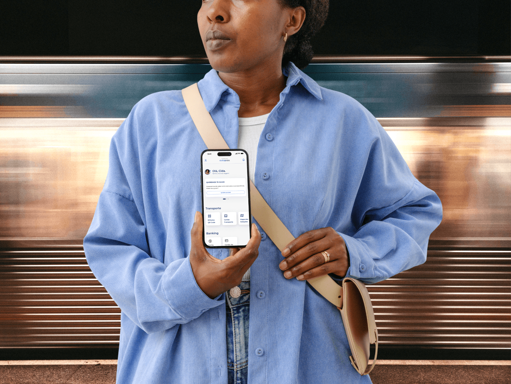
Autopass operates São Paulo's public transit network, serving 4M+ monthly active users across metro, train, and bus. I was brought in to redesign the core mobile experience, rebuilding the key flows for recharge, QR ticketing, and balance management to reduce friction and support new payment infrastructure. Working within a 13-week timeline without prior research data, I rebuilt navigation logic, designed edge case coverage, and wrote full handoff documentation. The redesign delivered a 20% improvement in customer satisfaction in the first quarter post-launch and a 10% increase in checkout completion.
Autopass operates São Paulo's public transit network, serving 4M+ monthly active users across metro, train, and bus. I was brought in to redesign the core mobile experience, rebuilding the key flows for recharge, QR ticketing, and balance management to reduce friction and support new payment infrastructure. Working within a 13-week timeline without prior research data, I rebuilt navigation logic, designed edge case coverage, and wrote full handoff documentation. The redesign delivered a 20% improvement in customer satisfaction in the first quarter post-launch and a 10% increase in checkout completion.
CLIENT
CLIENT
AUTOPASS
AUTOPASS
ROLE
ROLE
UI/UX DESIGNER
UI/UX DESIGNER
challenge
challenge
The existing app was functional but structurally fragile. Key actions like card requests and recharges were buried in unclear flows, and the QR section gave users no way to distinguish active, used, or shared tickets without guessing. The platform also needed to absorb new payment methods including Pix and QR codes without breaking existing flows. I was brought in to restructure navigation, redesign the ticketing system, and make the platform ready to scale, before any new features could land reliably.
The existing app was functional but structurally fragile. Key actions like card requests and recharges were buried in unclear flows, and the QR section gave users no way to distinguish active, used, or shared tickets without guessing. The platform also needed to absorb new payment methods including Pix and QR codes without breaking existing flows. I was brought in to restructure navigation, redesign the ticketing system, and make the platform ready to scale, before any new features could land reliably.
DELIVERABLES
DELIVERABLES
WIREFRAMES
WIREFRAMES
PROTOTYPES
PROTOTYPES
DOCUMENTATION
DOCUMENTATION
MOCKUPS
MOCKUPS
deadline
deadline
13 WEEKS
13 WEEKS
industry
industry
TRANSPORTATION
TRANSPORTATION
FINANCE
FINANCE
technology
technology
tools
tools
FIGMA
FIGMA
MIRO
MIRO
VIEW LIVE APP
Button Text
VIEW LIVE APP
Button Text

my role
my role
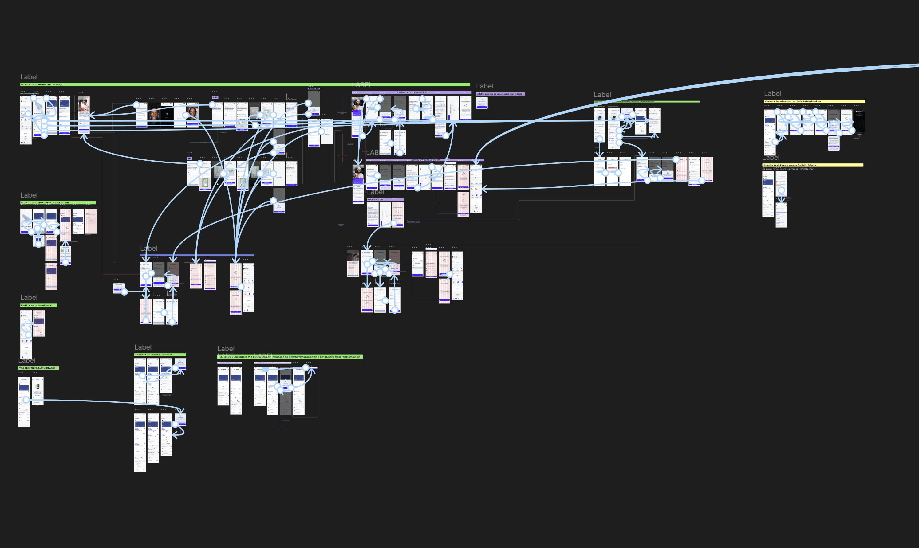
I was responsible for redesigning the full interface and navigation logic for the app. Beyond screens, I mapped and restructured flows for key operations like balance checking, card requests, recharges, and QR Code access. I also wrote detailed handoff documentation with logic, edge cases, error messaging, and business rules, making sure devs could build fast without back-and-forth. My focus was clarity, edge coverage, and delivering a system that could scale.
Image above: Full app structure and flows mapped, including onboarding, QR logic, balance and recharge rules, edge cases, and card management.
I was responsible for redesigning
the full interface and navigation logic
for the app. Beyond screens,
I mapped and restructured flows for key operations like balance checking,
card requests, recharges, and QR Code access. I also wrote detailed handoff documentation with logic, edge cases, error messaging,
and business rules, making sure devs could build fast without back-and-forth. My focus was clarity, edge coverage, and delivering a system that
could scale.
Image above: Full app structure and flows mapped, including onboarding, QR logic, balance and recharge rules, edge cases, and card management.
What I Focused On
What I Focused On
I focused on simplifying core flows like QR ticketing, recharge, and balance checking while accounting for edge cases like failed payments, shared tickets, and card reusability. Onboarding was added for new users, and I wrote detailed documentation to guide development without ambiguity.
I focused on simplifying core flows like QR ticketing, recharge, and balance checking while accounting for edge cases like failed payments, shared tickets, and card reusability. Onboarding was added for new users, and I wrote detailed documentation to guide development without ambiguity.
QR Code and Ticket Management
QR Code and Ticket Management
Separated active, used, and shared tickets to avoid
ambiguityAdded visual indicators and context-aware messaging to reinforce usability
Prevented confusion on expiration and sharing through color and status tags
Designed quick access to each ticket state without deep navigation
Separated active, used,
and shared tickets to avoid ambiguityAdded visual indicators and context-aware messaging
to reinforce usabilityPrevented confusion on expiration and sharing through
color and status tagsDesigned quick access to each ticket state without
deep navigation

What I Focused On
Buying QR Tickets
Buying QR Tickets
Streamlined the full purchase flow into just 3 steps with real-time feedback
Designed onboarding for subway and bus users to explain how QR access works
Handled Pix/credit/debit card failures with retry paths and clear messaging to reduce support load
Built fallback scenarios for card conflicts, expired credits, or exceeded limits
Ensured every purchase ends with confirmation and recovery options

PIX Ticket Purchase
PIX Ticket Purchase
A full demo of how users buy QR tickets for metro and train rides using Pix, from selection to confirmation, with clear steps, real-time feedback, and built-in fallback for failed payments.
A full demo of how users buy QR tickets for metro and train rides using Pix,
from selection to confirmation,
with clear steps, real-time feedback,
and built-in fallback for failed payments.
Outcomes
Outcomes
The redesign shipped within the 13-week timeline. Post-launch measurement by the Autopass team showed a 20% improvement in customer satisfaction scores within the first quarter and a 10% increase in checkout completion following the simplified ticketing flow and introduction of Pix and QR code payment options.
The redesign shipped within the 13-week timeline. Post-launch measurement by the Autopass team showed a 20% improvement in customer satisfaction scores within the first quarter and a 10% increase in checkout completion following the simplified ticketing flow and introduction of Pix and QR code payment options.
What I Learned
What I Learned
The constraint that shaped every decision here was designing for clarity without the safety net of user research. That forced a useful discipline: assume nothing, account for every edge case, and write documentation detailed enough that developers could build without back-and-forth. The bigger lesson was that edge cases are not optional polish, they are the product for 4 million people who rely on this app to get to work every day.
The constraint that shaped every decision here was designing for clarity without the safety net of user research. That forced a useful discipline: assume nothing, account for every edge case, and write documentation detailed enough that developers could build without back-and-forth. The bigger lesson was that edge cases are not optional polish, they are the product for 4 million people who rely on this app to get to work every day.
