nest:
plano financeiro
nest:
plano financeiro
Accelerating the future of financial management in Brazil
Accelerating the future of financial management in Brazil
SUMMARY
Most people manage their finances across a fragmented mix of spreadsheets, banking apps, and guesswork. Nest was designed to replace that with a single platform covering daily expenses, investment goals, emergency funds, and corporate spending — with a B2C layer for individuals and a B2B admin layer for organizations. The core design challenge was making a platform that handles genuinely complex financial data feel clear and actionable rather than overwhelming.
Most people manage their finances across a fragmented mix of spreadsheets, banking apps, and guesswork. Nest was designed to replace that with a single platform covering daily expenses, investment goals, emergency funds, and corporate spending — with a B2C layer for individuals and a B2B admin layer for organizations. The core design challenge was making a platform that handles genuinely complex financial data feel clear and actionable rather than overwhelming.
CLIENT
FIAP
strategy
UI/UX DESIGN
Web Design
Content Guide

My Role
I was the sole designer on Nest, responsible for the full product: UX strategy, information architecture, UI design across web and mobile, and the content guide. I worked with FIAP stakeholders to translate the platform's dual B2C and B2B value proposition into a coherent design system that could handle high-density financial data without overwhelming the user.
One of the core UX pillars for Nest
was to reduce cognitive overload
while fostering healthy financial habits. Instead of simply listing assets in a generic table, I implemented a Categorized Investment Framework. By grouping investments into specific categories like Emergency Fund and Financial Goals, we leverage the psychological principle of Mental Accounting.
Consequently, this structure helps users assign specific purposes to
their capital and significantly reduces the impulse to withdraw funds prematurely. Furthermore,
this modular approach ensures
that the interface remains clean and organized as each category acts
as a dedicated workspace for the user.
One of the core UX pillars for Nest was to reduce cognitive overload while fostering healthy financial habits. Instead of simply listing assets in a generic table, I implemented a Categorized Investment Framework. By grouping investments into specific categories like Emergency Fund and Financial Goals, we leverage the psychological principle of Mental Accounting.
Consequently, this structure helps users assign specific purposes to their capital and significantly reduces the impulse to withdraw funds prematurely. Furthermore, this modular approach ensures that the interface remains clean and organized as each category acts as
a dedicated workspace for the user.
the challenge
The main challenge was to design a scalable architecture
that could handle high density data without overwhelming
the user. Since the platform manages complex variables
like emergency funds, retirement planning, and B3 integrated investments, the UI needed to be extremely intuitive.
Moreover, we had to solve a specific B2B pain point regarding
the lack of transparency in corporate spending. Therefore,
the goal was to create a seamless transition between
the personal dashboard and the corporate environment.
The main challenge was to design
a scalable architecture that could handle high density data without overwhelming the user. Since the platform manages complex variables
like emergency funds, retirement planning, and B3 integrated investments, the UI needed to be extremely intuitive. Moreover, we had to solve a specific B2B pain point regarding the lack of transparency
in corporate spending. Therefore,
the goal was to create a seamless transition between the personal dashboard and the corporate environment.
The main challenge was to design a scalable architecture that could handle high density data without overwhelming the user. Since the platform manages complex variables like emergency funds, retirement planning, and B3 integrated investments, the UI needed to be extremely intuitive. Moreover, we had to solve a specific B2B pain point regarding
the lack of transparency in corporate spending. Therefore, the goal was to create a seamless transition between the personal dashboard and the corporate environment.
DELIVERABLES
PROTOTYPES
DOCUMENTATION
MOCKUPS
deadline
8 WEEKS
industry
finance
TECHNOLOGY
tools
FIGMA
UX Strategy: Mental Accounting
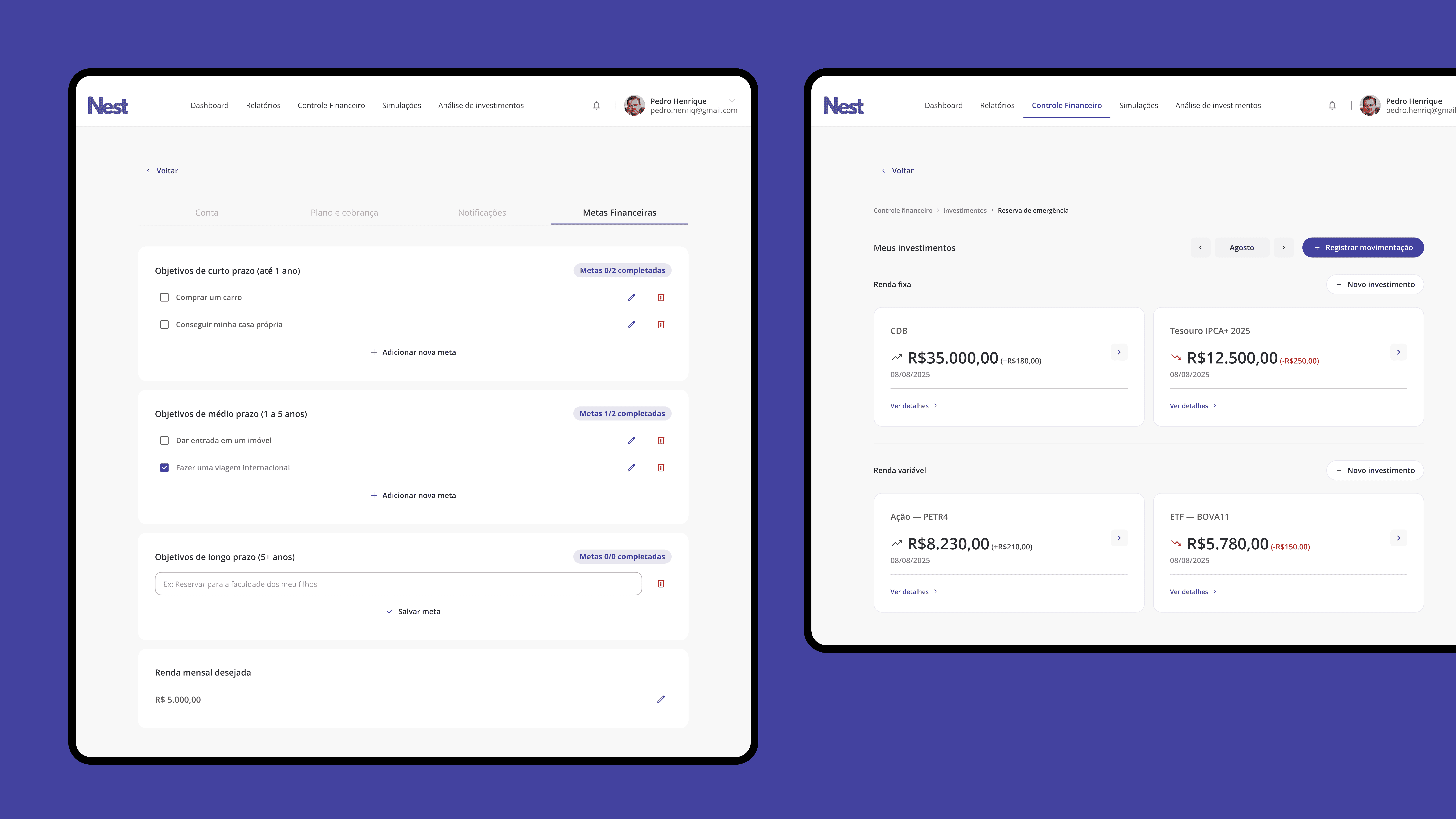
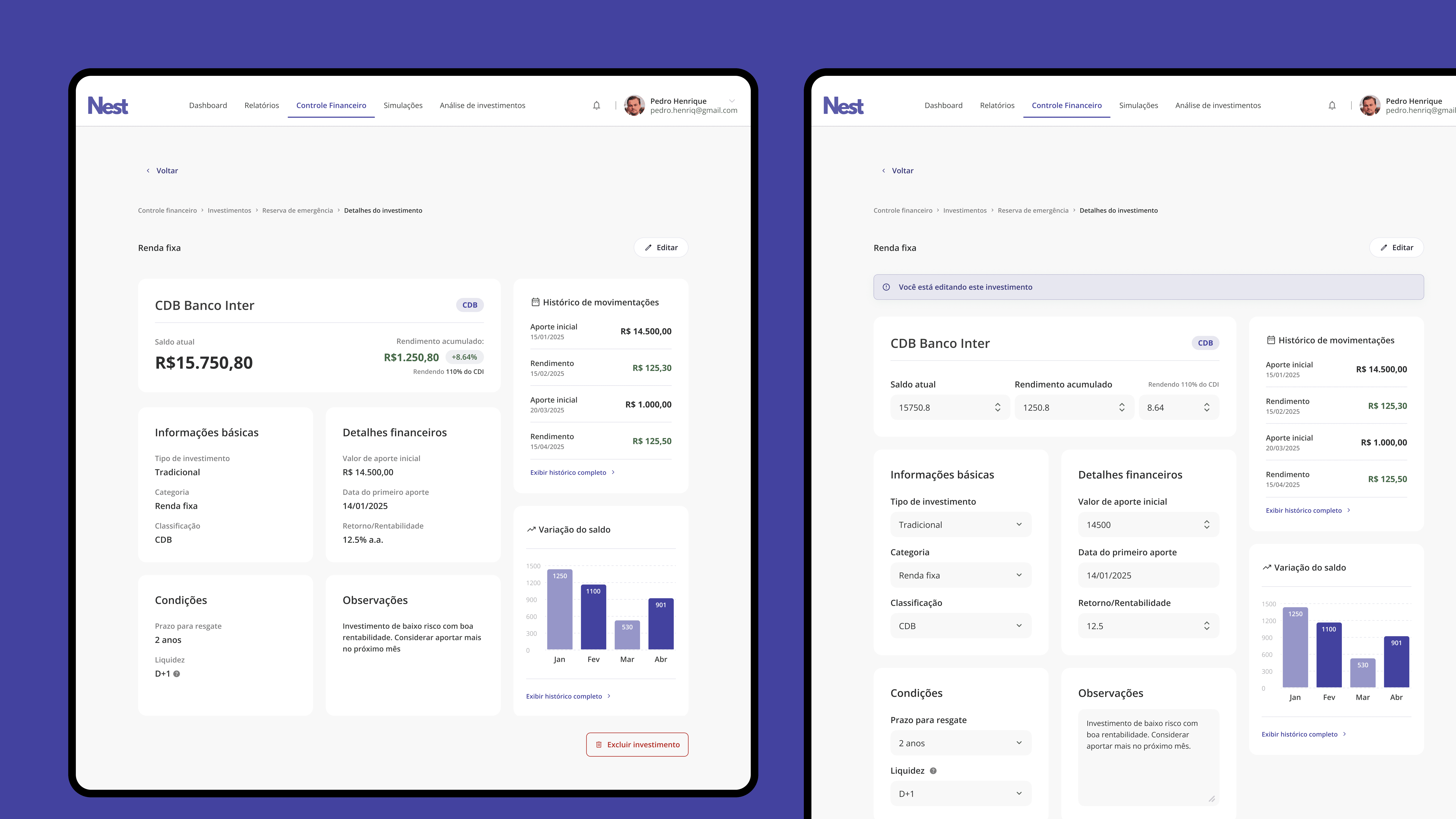
One of the core UX decisions for Nest was reducing cognitive overload while nudging healthier financial habits. Rather than listing assets in a generic table, I built a Categorized Investment Framework that groups investments by purpose: Emergency Fund, Financial Goals, Retirement. This draws on the psychological principle of Mental Accounting, which shows that people make better financial decisions when money has a named purpose rather than sitting in an undifferentiated pool. The modular structure also keeps the interface scannable as the user's portfolio grows, since each category acts as its own dedicated workspace rather than adding rows to an already dense table.
One of the core UX pillars for Nest
was to reduce cognitive overload
while fostering healthy financial habits. Instead of simply listing assets in a generic table, I implemented a Categorized Investment Framework. By grouping investments into specific categories like Emergency Fund and Financial Goals, we leverage the psychological principle of Mental Accounting.
Consequently, this structure helps users assign specific purposes to
their capital and significantly reduces the impulse to withdraw funds prematurely. Furthermore,
this modular approach ensures
that the interface remains clean and organized as each category acts
as a dedicated workspace for the user.
One of the core UX pillars for Nest was to reduce cognitive overload while fostering healthy financial habits. Instead of simply listing assets in a generic table, I implemented a Categorized Investment Framework. By grouping investments into specific categories like Emergency Fund and Financial Goals, we leverage the psychological principle of Mental Accounting.
Consequently, this structure helps users assign specific purposes to their capital and significantly reduces the impulse to withdraw funds prematurely. Furthermore, this modular approach ensures that the interface remains clean and organized as each category acts as
a dedicated workspace for the user.
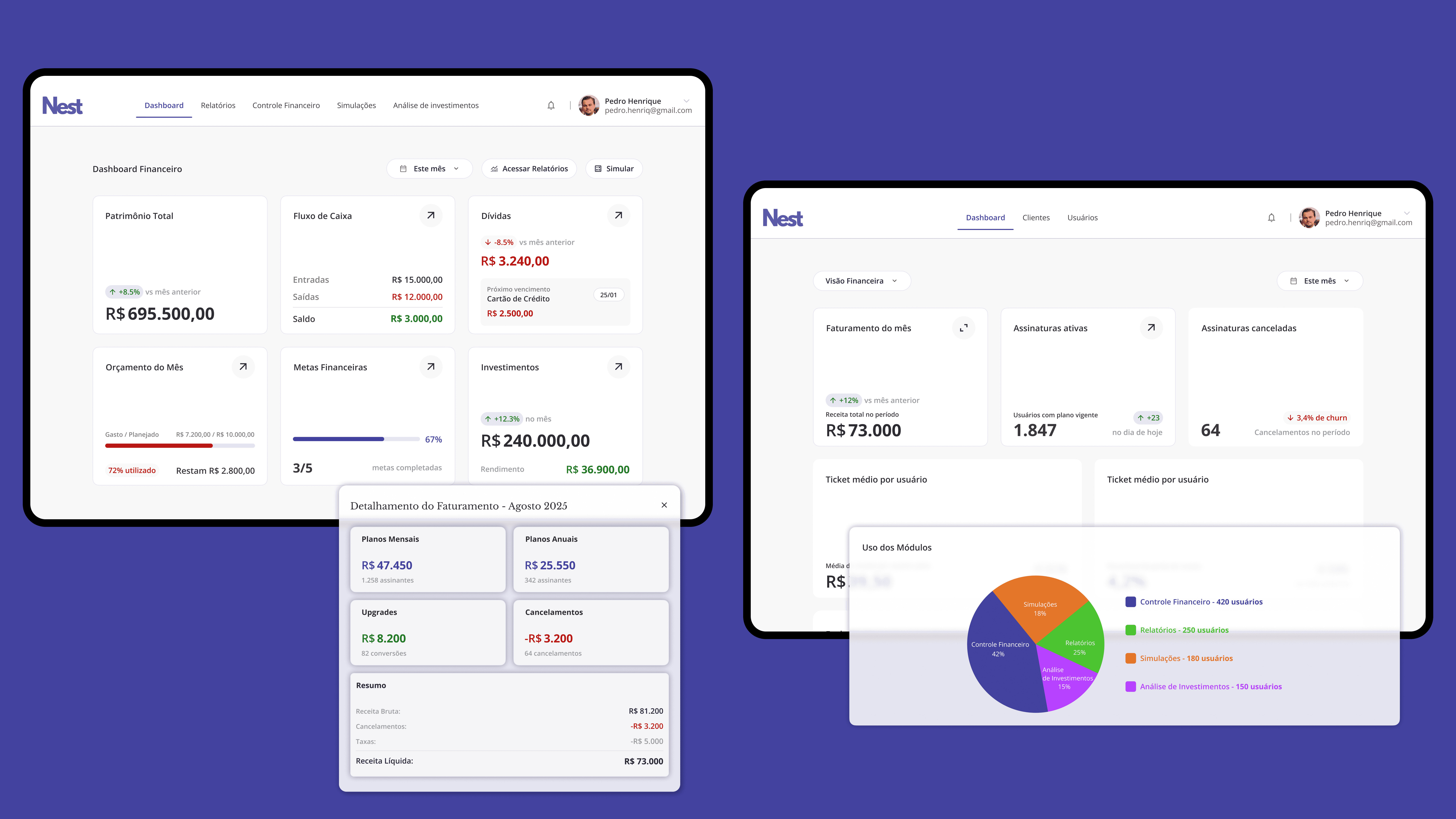
Interface Execution: The Mosaic Dashboard
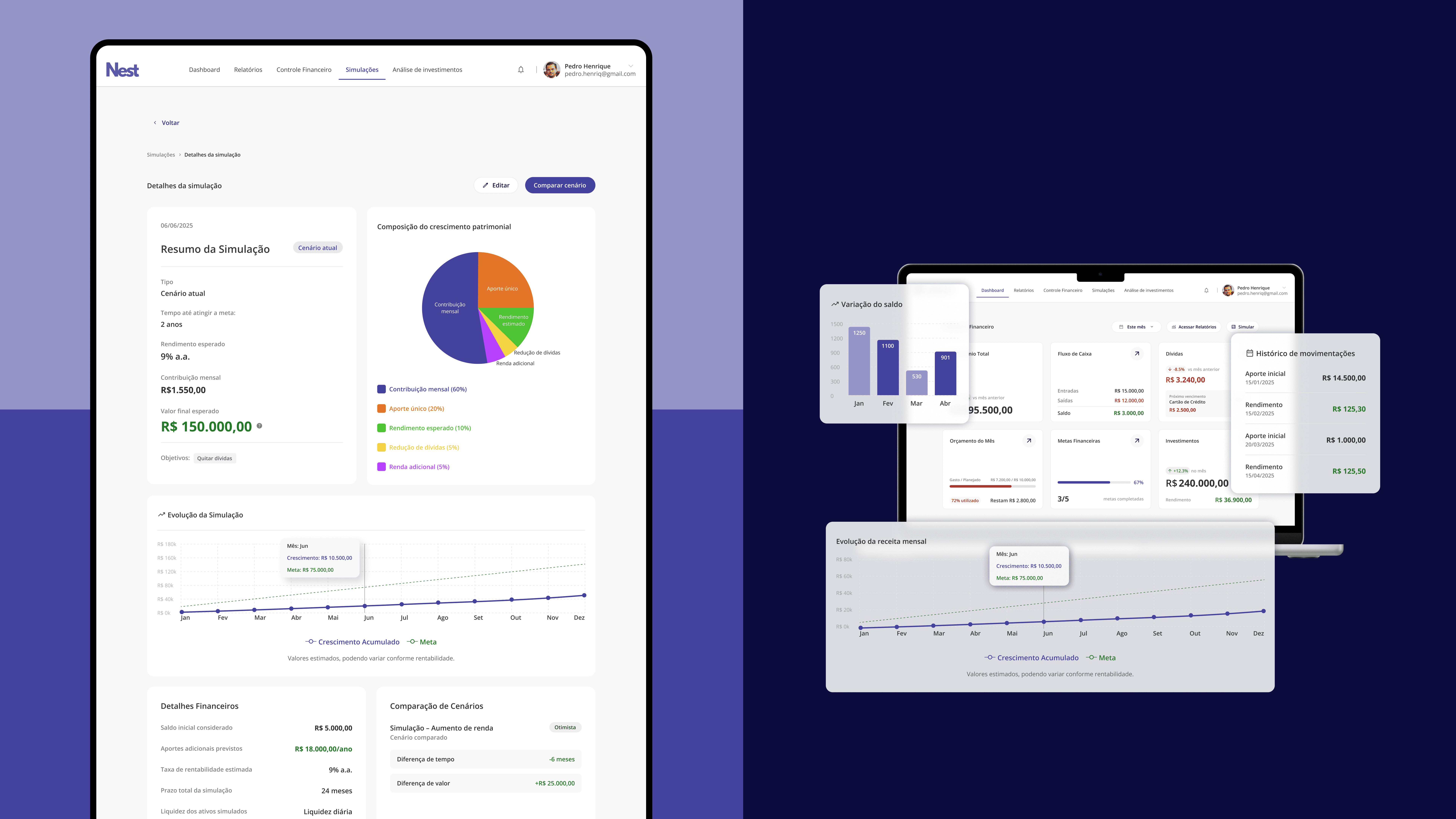
The main dashboard uses a modular mosaic layout that gives users a complete view of their financial health, net worth, cash flow, debt status, in a single scannable screen. Each module is also a navigation shortcut, letting users drill into specific sections like financial control or account details without losing context. For the admin layer, I designed a dual-perspective dashboard where administrators can toggle between a corporate health view and individual user metrics, giving business owners the macro visibility they need without a separate tool.
The main dashboard uses a modular mosaic layout that gives users a complete view of their financial health, net worth, cash flow, debt status, in a single scannable screen. Each module is also a navigation shortcut, letting users drill into specific sections like financial control or account details without losing context. For the admin layer, I designed a dual-perspective dashboard where administrators can toggle between a corporate health view and individual user metrics, giving business owners the macro visibility they need without a separate tool.
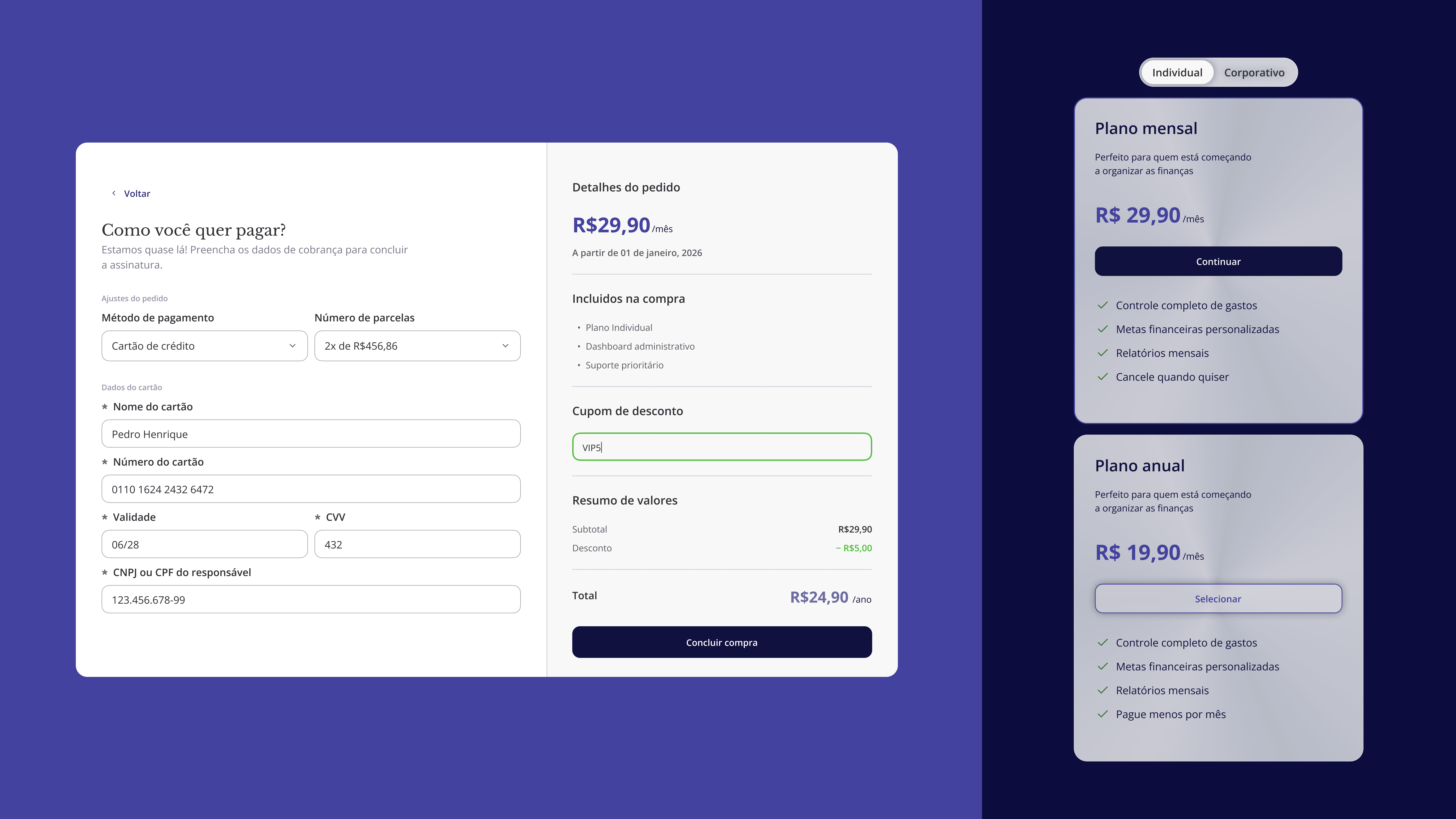
Landing Page & Conversion
The landing page is built around showing rather than telling. A "How It Works" section walks users through the platform's logic before they sign up, reducing the trust gap that most fintech products struggle with. A simulations module lets potential users model the impact of their financial decisions in a low-stakes environment, which directly supports conversion in the pricing section by making the value tangible before asking for a commitment.
The landing page is built around showing rather than telling. A "How It Works" section walks users through the platform's logic before they sign up, reducing the trust gap that most fintech products struggle with. A simulations module lets potential users model the impact of their financial decisions in a low-stakes environment, which directly supports conversion in the pricing section by making the value tangible before asking for a commitment.

Final Lessons
Every fintech project is a negotiation between trust and usability. The biggest lesson from Nest was that data is only useful when it tells someone what to do next, not just what is happening. The bento-style dashboard was a direct response to that: instead of a monitoring tool, I wanted something that felt like a planning tool. The other lesson was persona depth. Designing for a business owner managing corporate spend and a 28-year-old building an emergency fund requires genuinely different hierarchy, language, and feedback patterns, even when they are looking at the same underlying data.
Every fintech project is a negotiation between trust and usability. The biggest lesson from Nest was that data is only useful when it tells someone what to do next, not just what is happening. The bento-style dashboard was a direct response to that: instead of a monitoring tool, I wanted something that felt like a planning tool. The other lesson was persona depth. Designing for a business owner managing corporate spend and a 28-year-old building an emergency fund requires genuinely different hierarchy, language, and feedback patterns, even when they are looking at the same underlying data.

1:28 AM
, EST